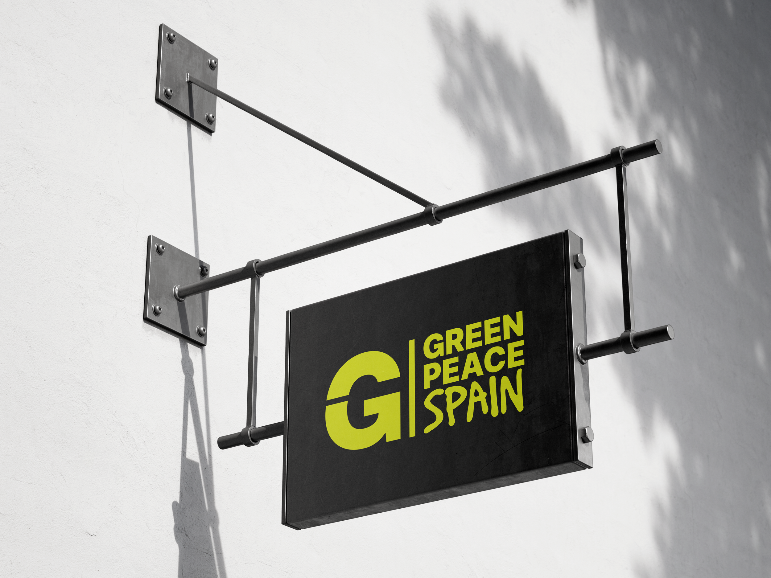
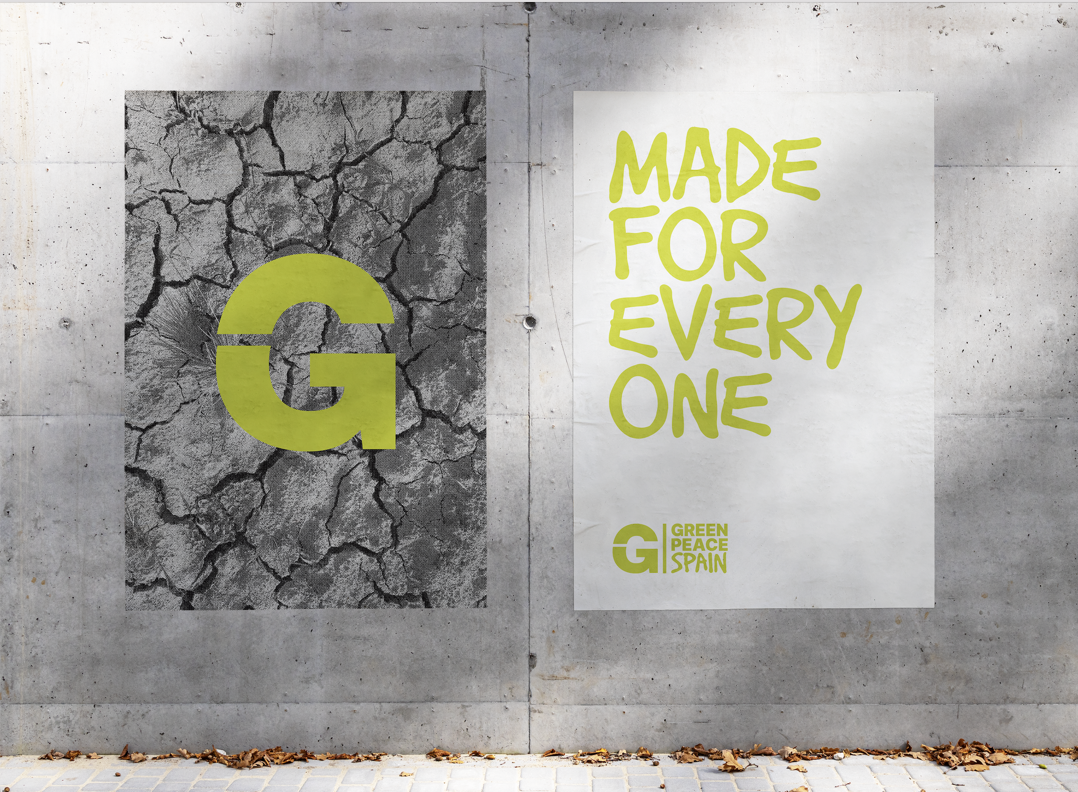
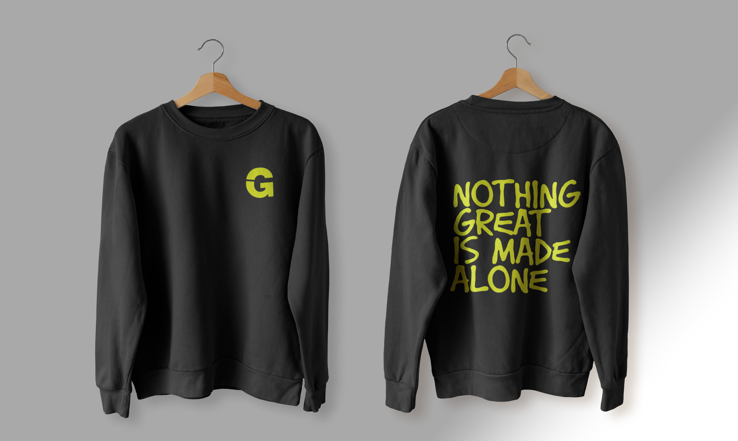
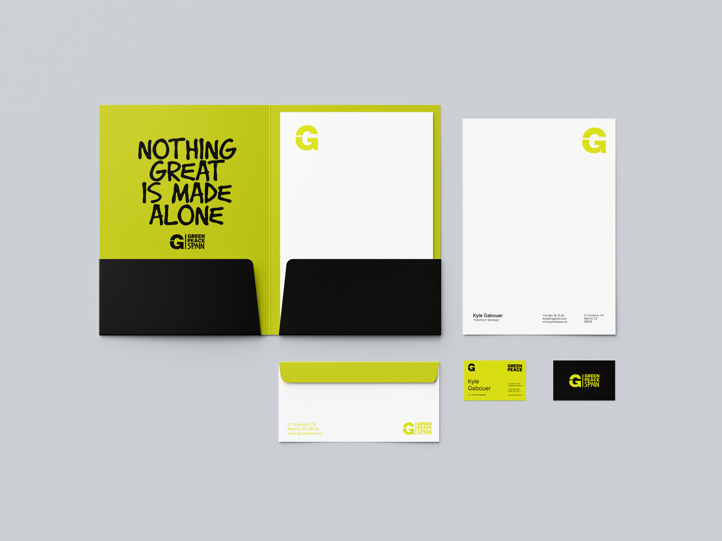
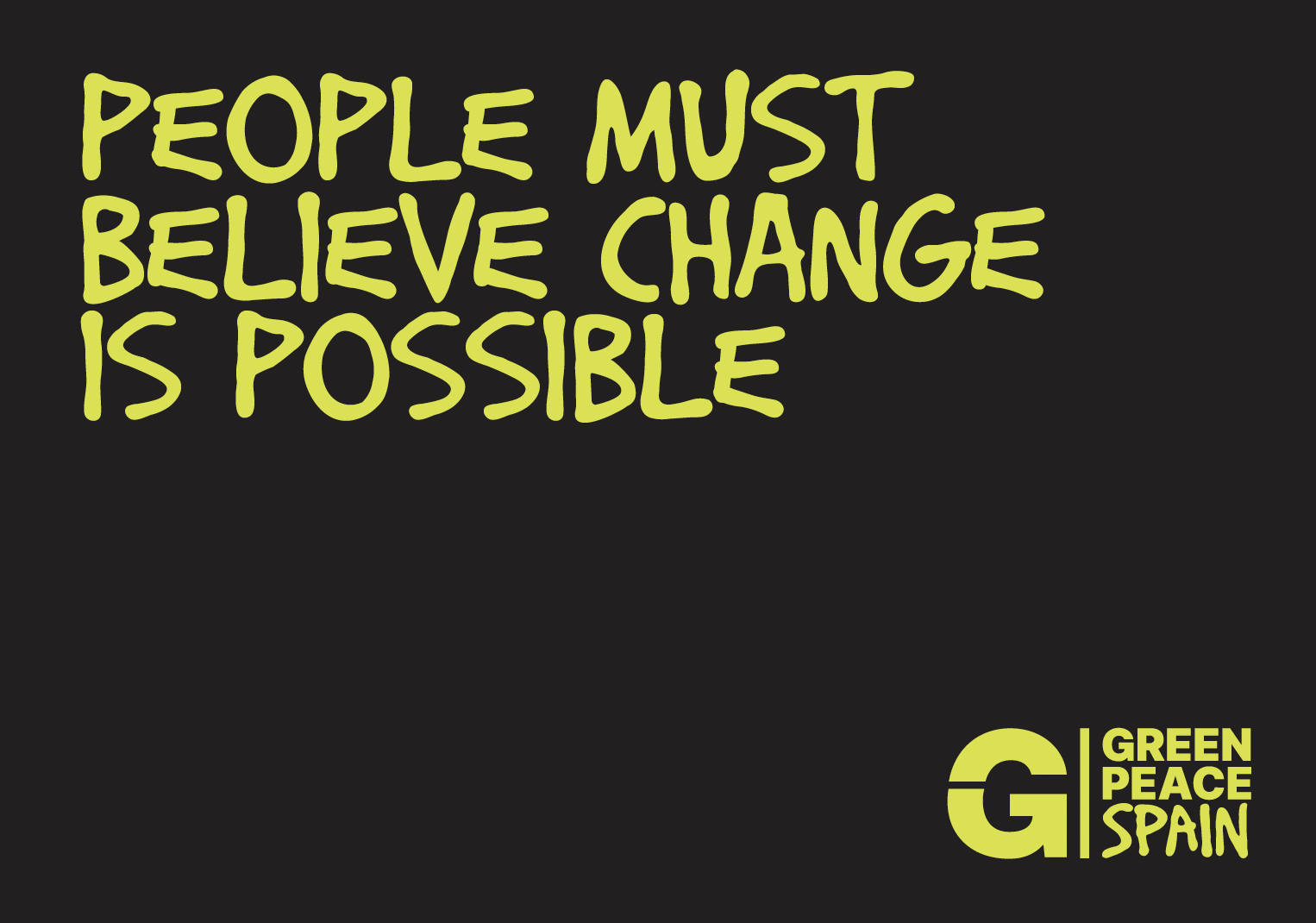
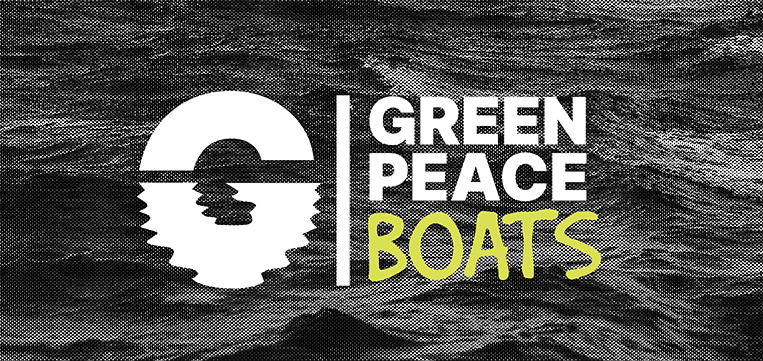
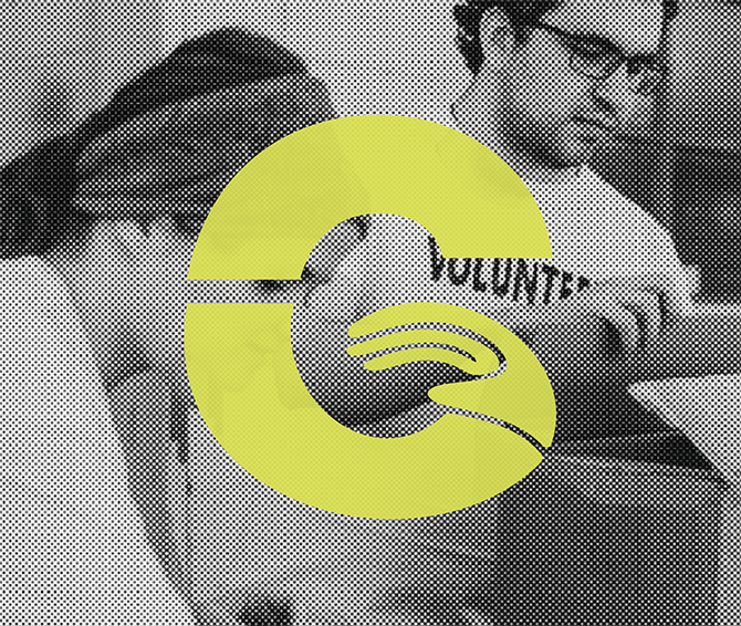
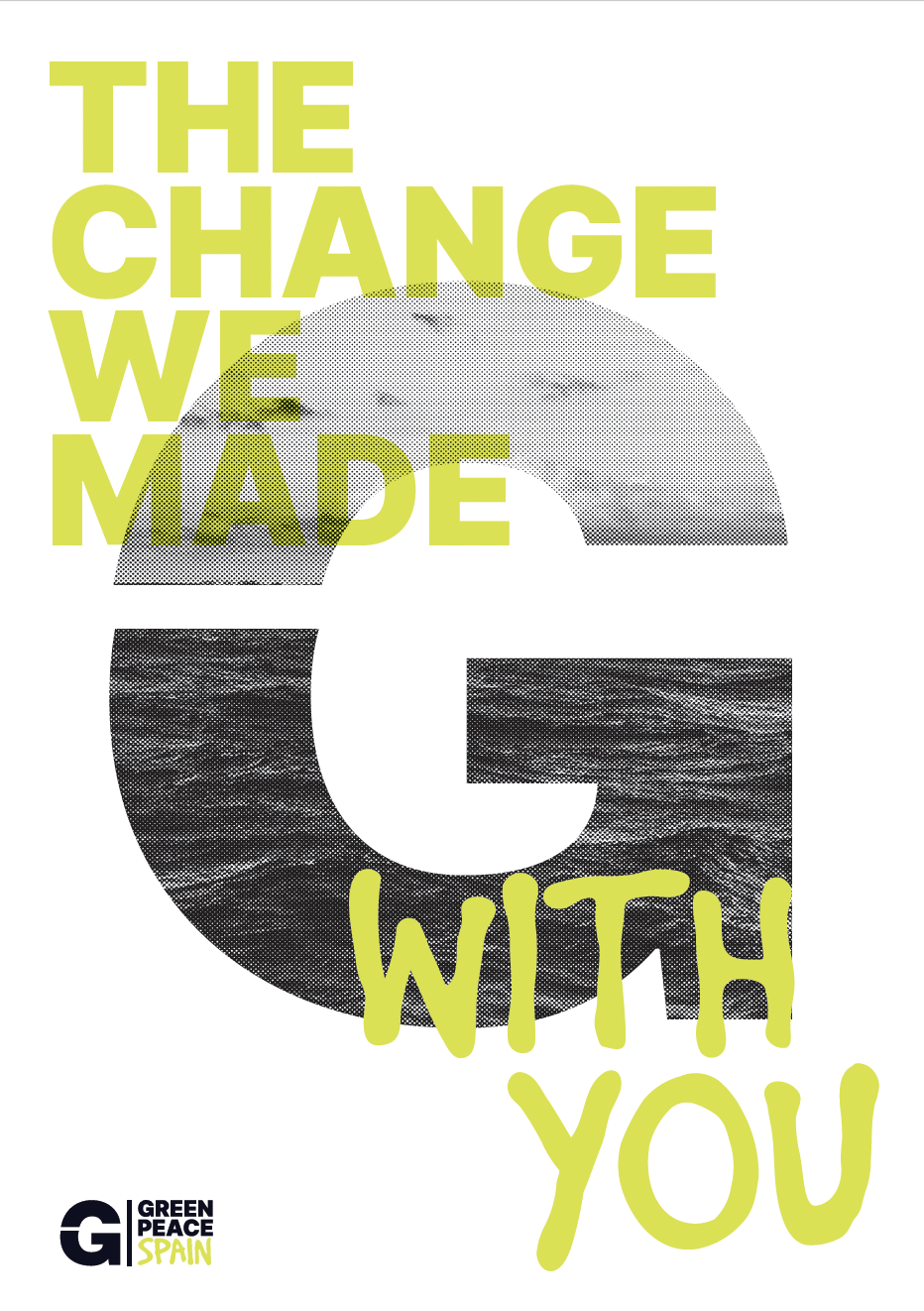
GREENPEACE SPAIN
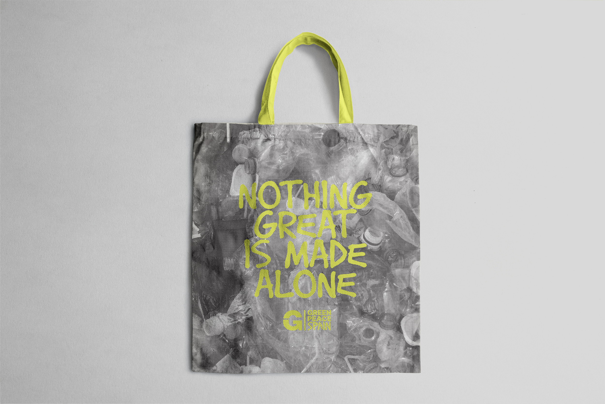
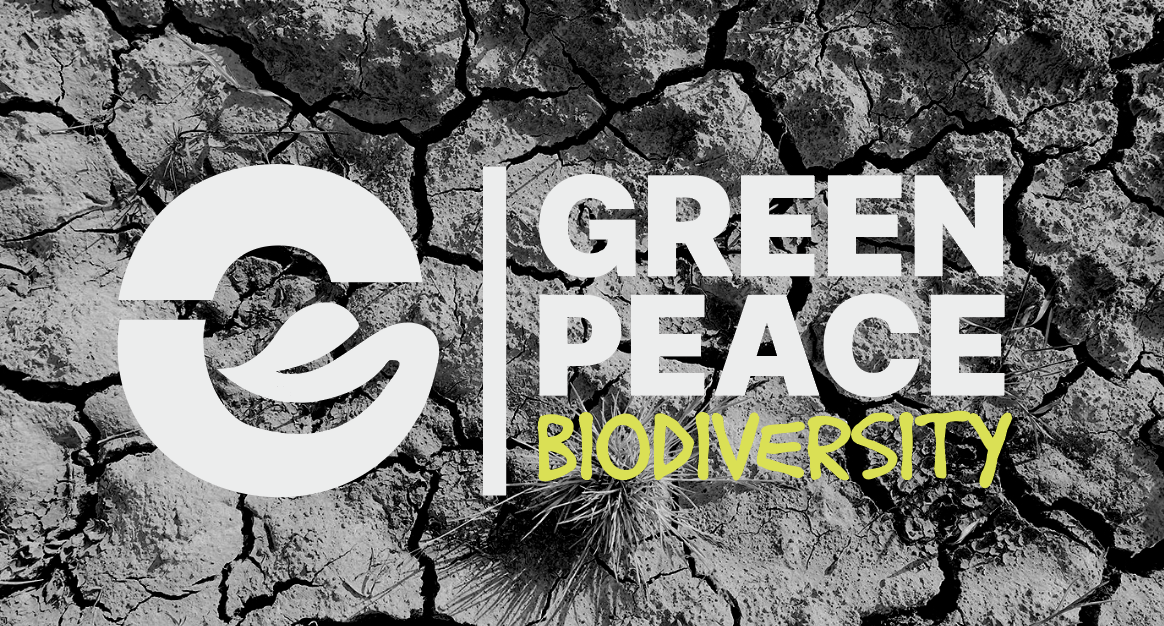
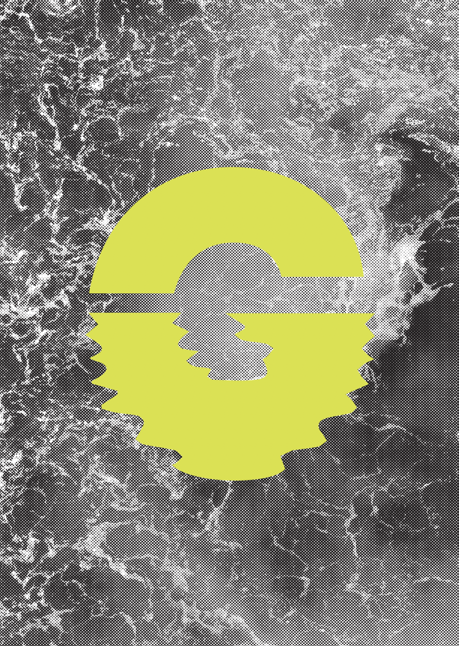
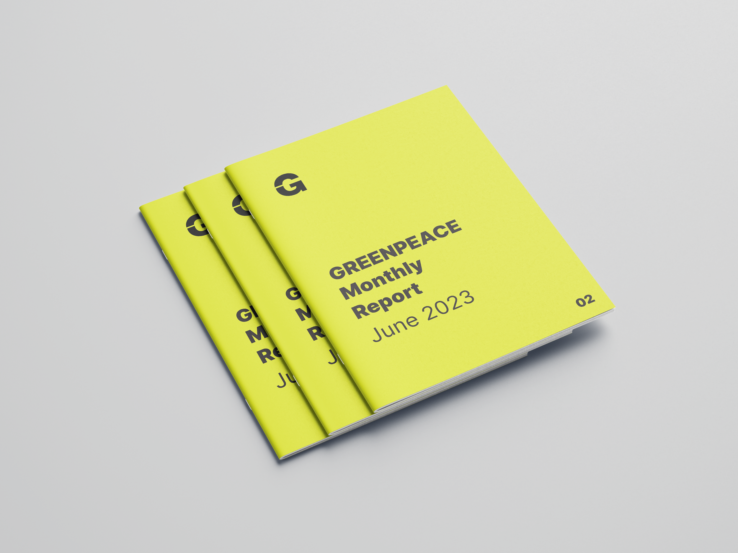
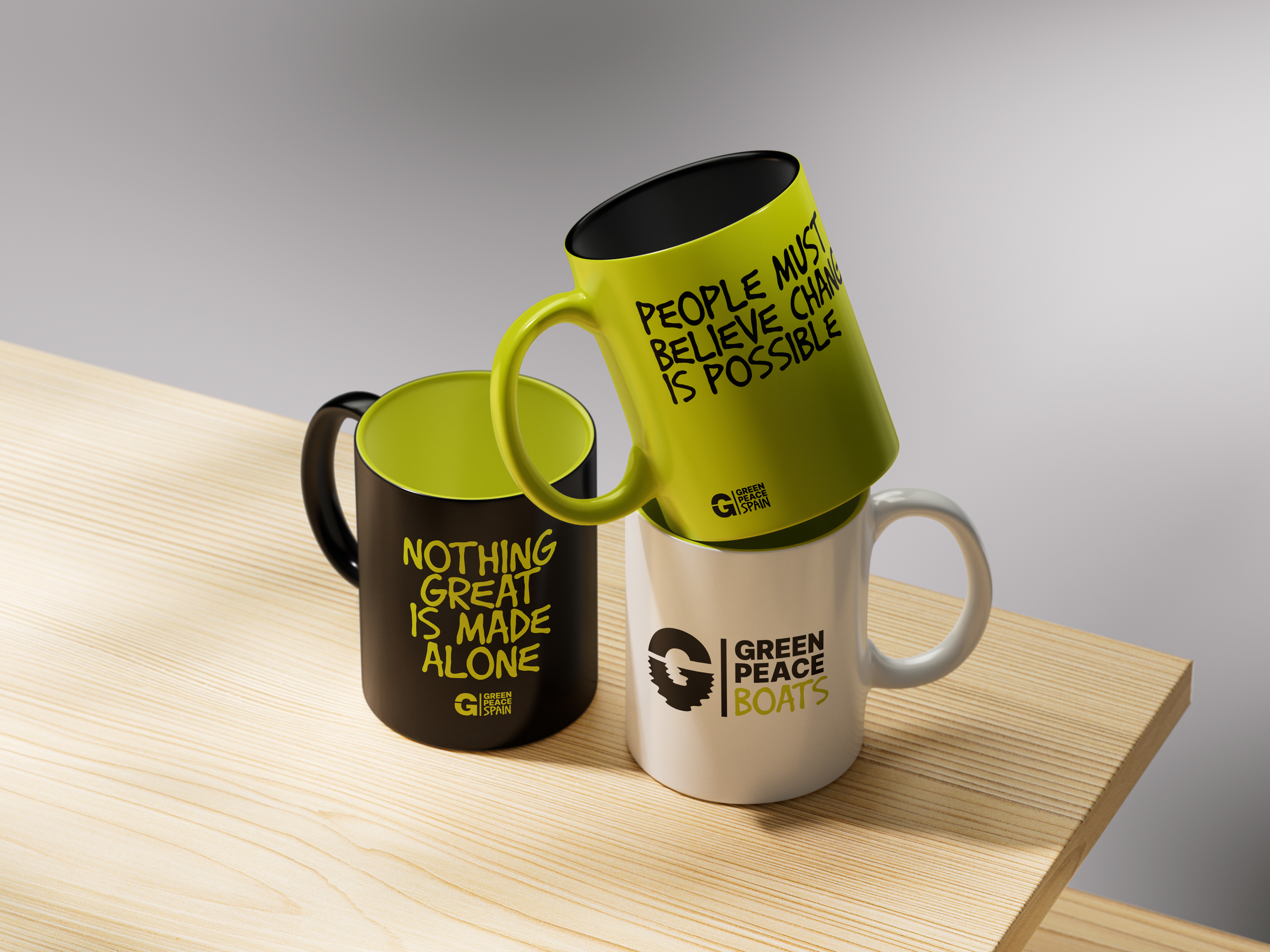
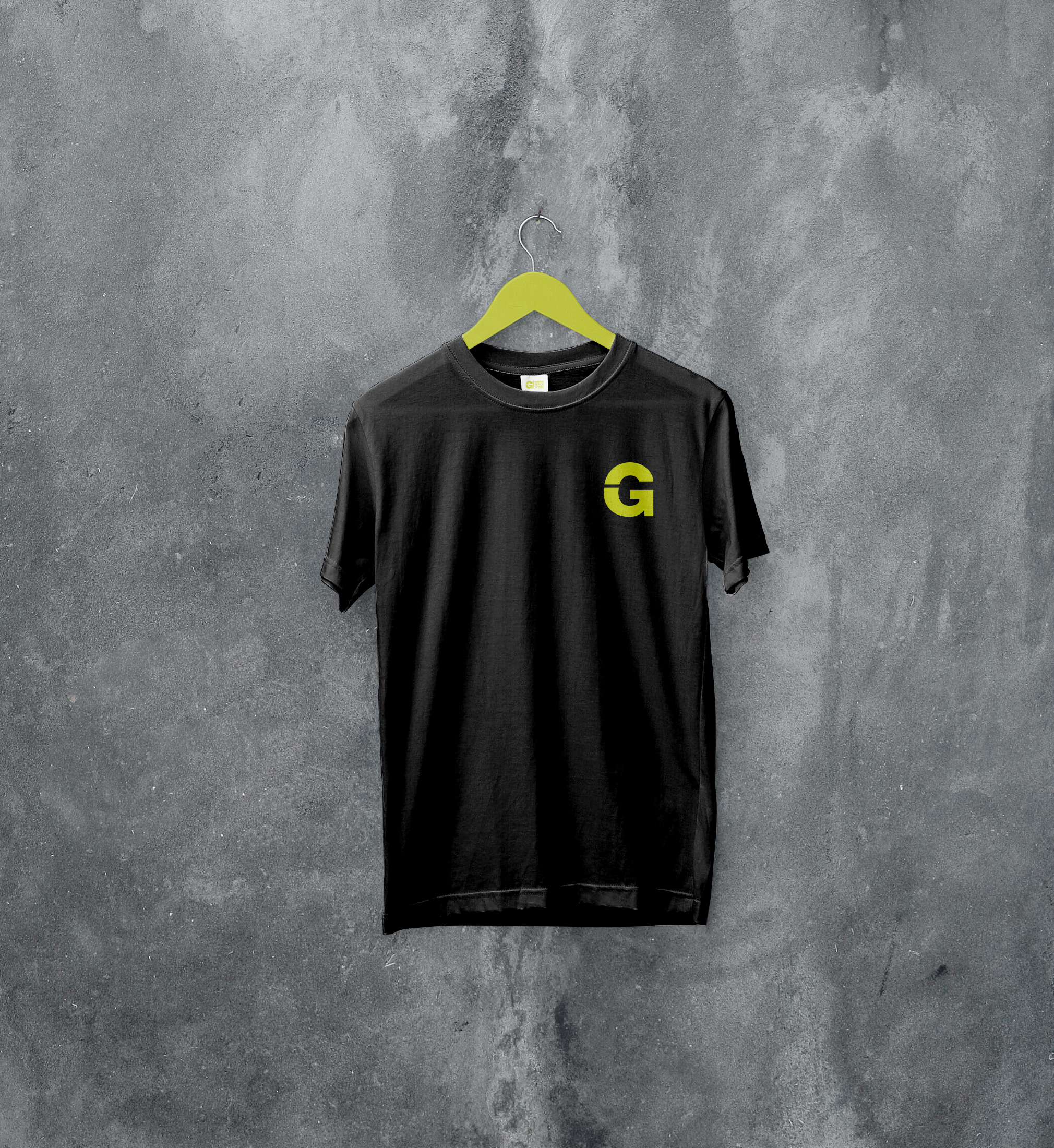
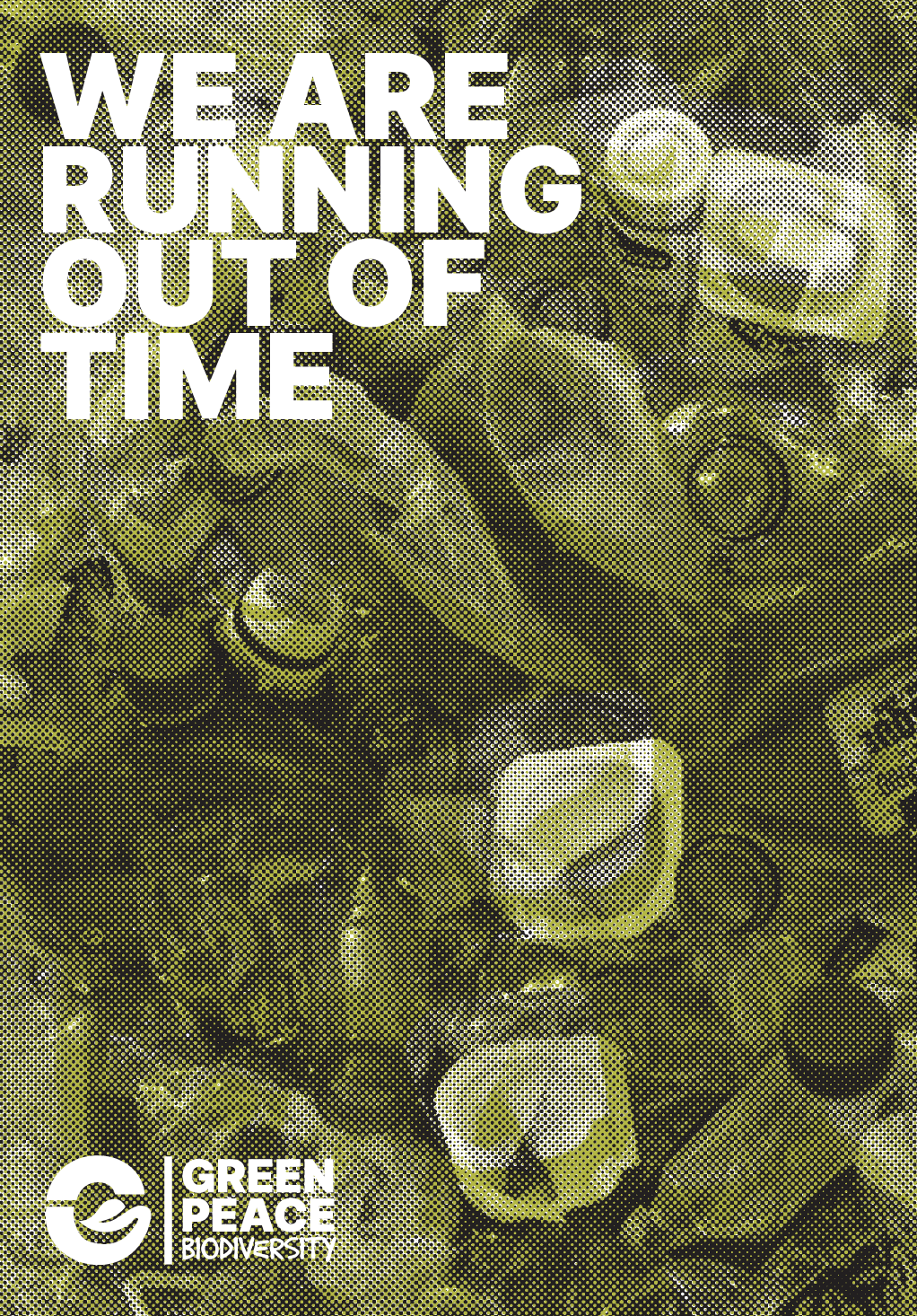
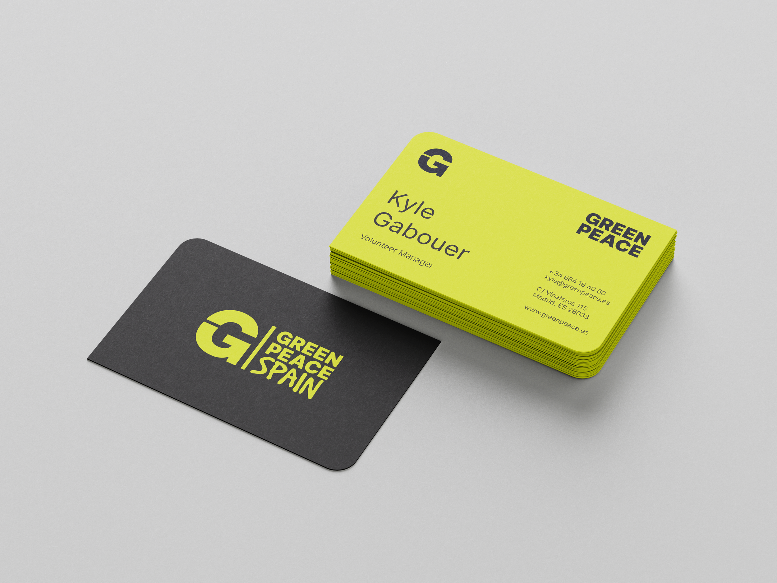
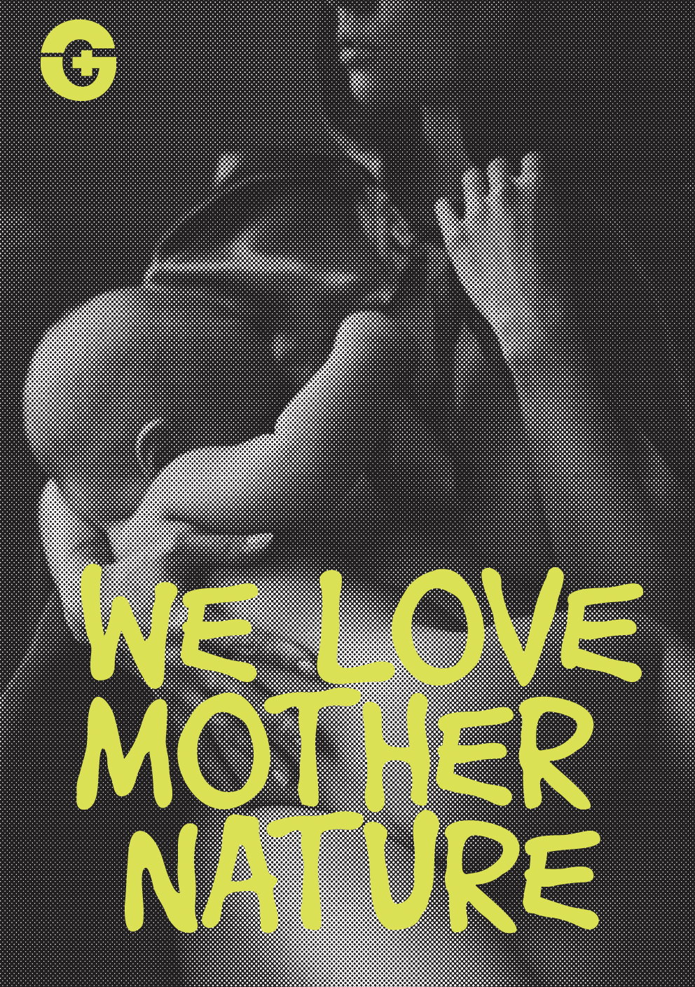
Redesigning the brand and transforming it into a dynamic identity tailored to its areas of work: boats, biodiversity, volunteering, and ecofeminism. The logo is based on a divided “G” that changes its bottom for each area. The top is fixed and represents a bridge between Greenpeace and the people. A visual treatment was also designed to create a coherent, contemporary, and unified identity while ensuring the recognition of the organization.